So.
We all have, and use and rely on our websites don’t we? We rely on them to be the window on our businesses, our face to new customers. The thing that sets the tone of what we do and how we see ourselves. Well website design has come on a long way since the nineties. No longer a very restrictive size and format, approved typefaces and colours and a genuinely ugly finished product that looked somewhere between an Eighties computer game and a church newsletter.
Now, in this age of easy templates we can quite quickly make up a professional looking website complete with stock photography, pastel colours, and beautifully hand crafted typefaces. I’m sure with the advent of AI, the process will become much easier and cheaper to do as we get much further into the future.
But in the process of going from having no central online presence, to a finished website, are we missing out on some important details. Are we guilty of using templates that hide our originality and make us all look like each other. Are we satisfied with a ‘me too’ look? just because it’s what is accepted as the norm? Is this going to help us and get us noticed?
I put it to you that with just a little thinking in the early stages about how you want your business to look, you should also spend time thinking about how you want to be seen., and more importantly, how you want your website visitors to use your site, based on paying attention to how people would prefer to use your website.
If you’re not sure, you can get a guiding idea on how other people might want to use your website, by how YOU like to interact with other businesses websites.
The way society has changed and been influenced by what is called ‘content’ both in the social media sphere as well as the entertainment world is a good indicator of where you ought to be when presenting your own content - for that is surely what is is, as well as your shop front - and you will most likely find that today’s content consumers are far less charitable in their choices of what, and particularly how much, they can actually be bothered to take in.This is not just a generational thing neither. The sheer volume of choice and range the days is informing strong opinions on what content makes the grade and gets noticed, read, watched, indulged in, and what isn’t.
It’s reminiscent of the days when an A&R person in the record industry might give your expensive, carefully and lovingly crafted demo tape about 30 seconds of listening before it went winging its way binwards. Everyone today is that A&R guy or gal, and judge quickly what they can and cannot be bothered to spend any time on at all, let alone 30 seconds.
So why don’t you think about how people WILL interact with your website, not just how you want them to.
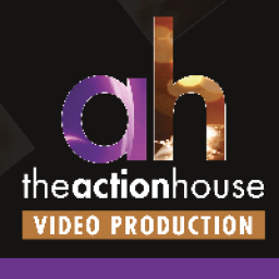
When designing the new website for The Action House and linking it to LANCASHARE as our business frontage, I can assure you that we made the website as simple to use as possible so that a busy marketing or promotions person could spend as little of their very valuable time reading text, constantly pressing mouse buttons to navigate around and figuring out what goes where and where to look first.
In a nutshell, we did several things to achieve this:
We didn’t rely on templates we don’t want to look like someone else. The design grew from our existing business cards and marketing materials where we went for strong bold colours that are associated with film making, against a dark background which is also used extensively in the cinema world. Shorthand link to hollywood? Tick.
We looked carefully at the range of work we have delivered to clients over the past 14 years or so, and split it into 15 simple genres. These genres can be seen in BOLD WHITE LETTERING underneath a thumbnail for a showreel. Below that is one or at most two short sentences - headlines if you like, which don’t even need to be read, they are very much secondary in importance and we made them look that way in the design.
Since the best way for a video production company to show off its wares is of course the humble showreel, our website was always going to feature them. So the thumbnail goes dark when the cursor passes over it indicating that it’s live. Click once on the thumbnail of the genre that interests you, and it will play a one minute short showreel of work and then the window automatically closes leaving you back at the main screen.
In addition, there is a live link to create an email to us, a phone number, and another live link to a contact page.
And that’s it. A simple two-page website with minimal clicks and minimal text to read. An easy and obvious layout that shows you what you need to find easily, and without having to invest much time to see what the Action House business is all about. Just enough to give people the confidence to get in touch when they want to take it further.
 Essential Sourcing Ltd